


USU FOODHUB
As one of the key cost-of-living initiatives for the University of Sydney Student Union, the existing FoodHub was small, cramped and not functioning effectively to keep up with student demand. The branding wasn’t updated in line with USU’s rebrand and the space needed an update.
Over the course of a few months, a full strategic research project was undertaken, surveys completed by 500 students and staff and insights were used to develop the new FoodHub brand. A new location was renovated and branding aligned with USU Student Savers sub-brand, and the new FoodHub serves 450 students a day.
︎ Strategic research
︎ Branding
︎ Large and small scale print design
︎ Branding
︎ Large and small scale print design
Photographs by Michael Media


WELCOME FEST 2026
Welcome Fest is the most iconic and impactful student O-week in Australia, welcoming over 40,000 visitors to USYD campus each semester. The previous branding had been used for the last 3 years, but was no longer aligned and a fresh brand identity was required, alongside a new concept for students’ first interaction with the USU.
Taking a dynamic approach, the new brand acknowledges the rush and excitement of new beginnings and differen pathways. A ‘W’ motif is included across this concept which is a direct representation of the entire USU Welcome Program, extending our offering beyond Welcome Fest on its own.
︎ Large scale print design
︎ Digital and social campaign
︎ Wayfinding
︎ Event collateral
Photographs by Michael Media
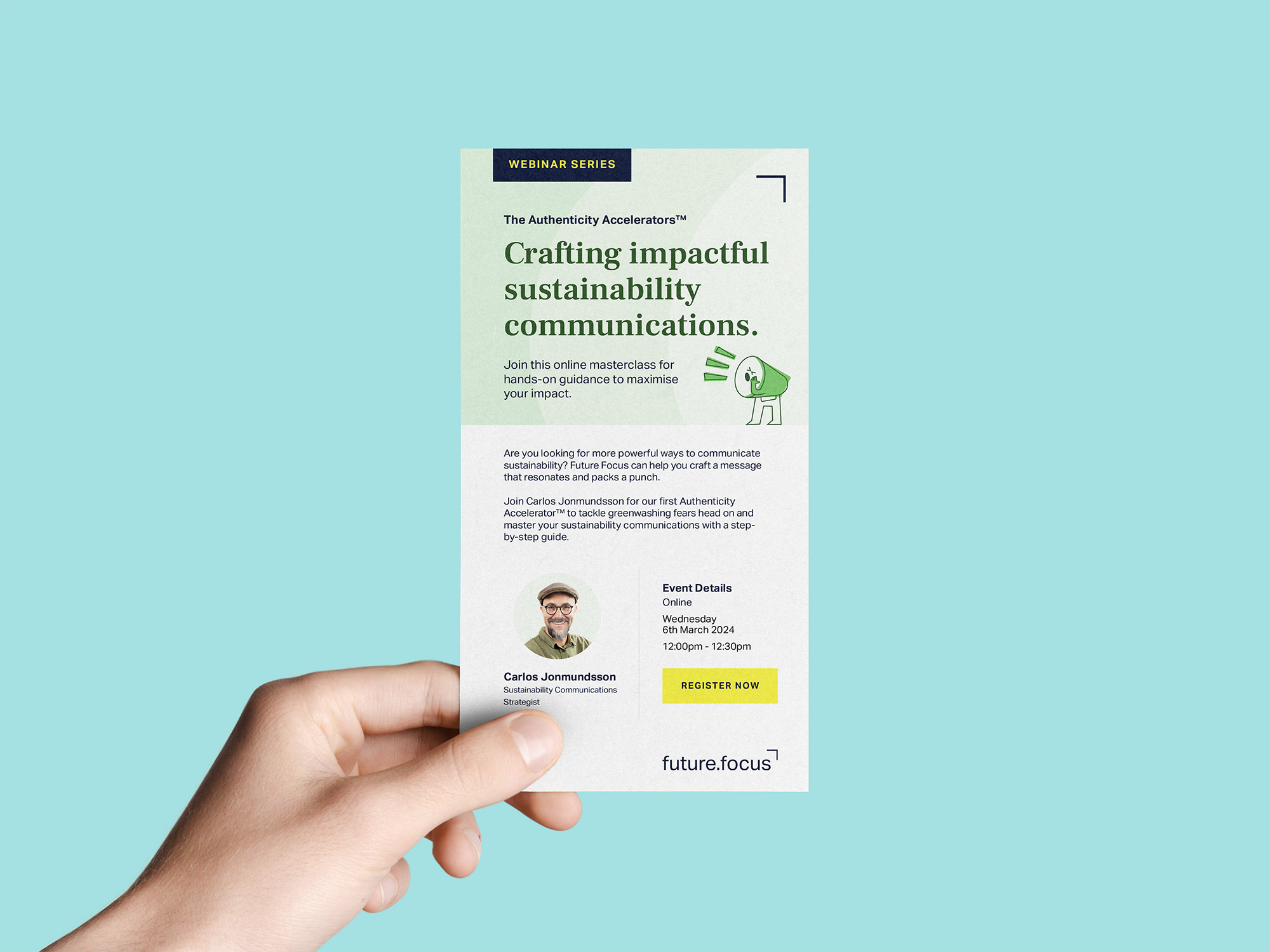

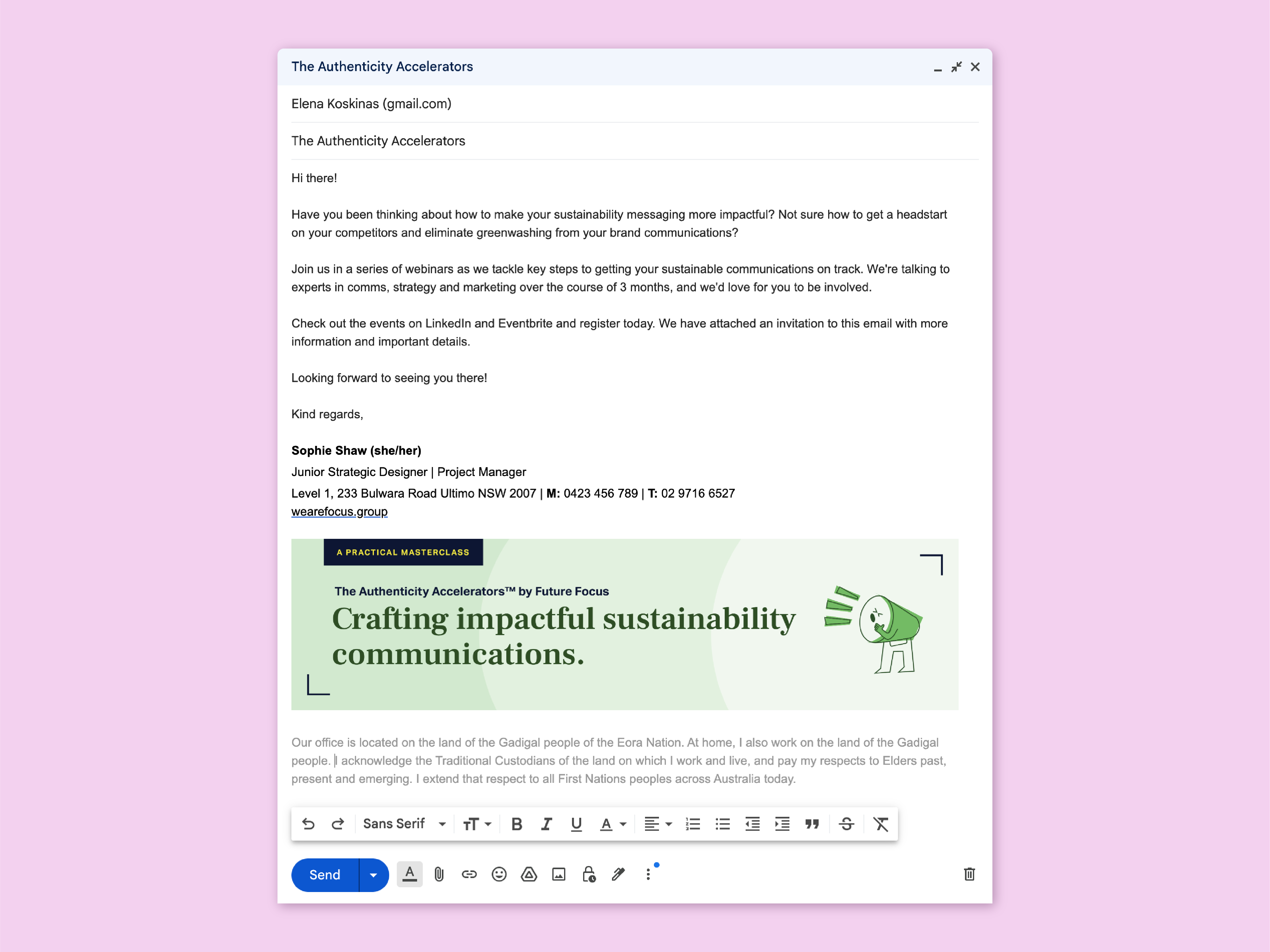

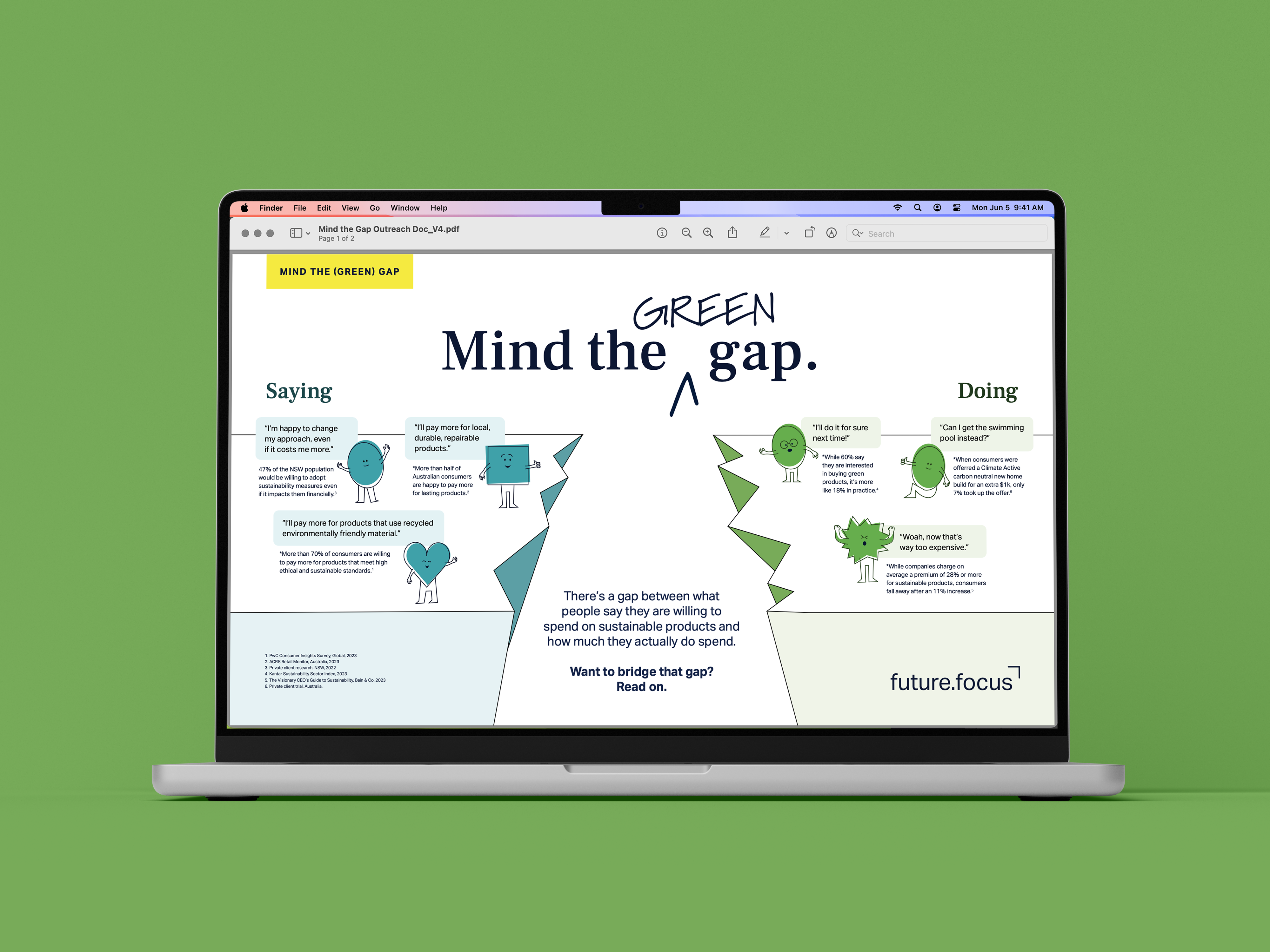
FUTURE FOCUS
Parallel to their existing brand guidelines, sustainability consultancy Future Focus were looking to develop a new brand language to promote a range of events. This new look and feel would be utilised across promotional campaigns posted on LinkedIn and Instagram.
A suite of playful characters were developed, relating directly to key sustainability marketing messaging. These characters were used on various campaign assets to enhance the visual language and drive engagement and interaction for Future Focus’ events.
︎ Print and OOH design
︎ Artworking

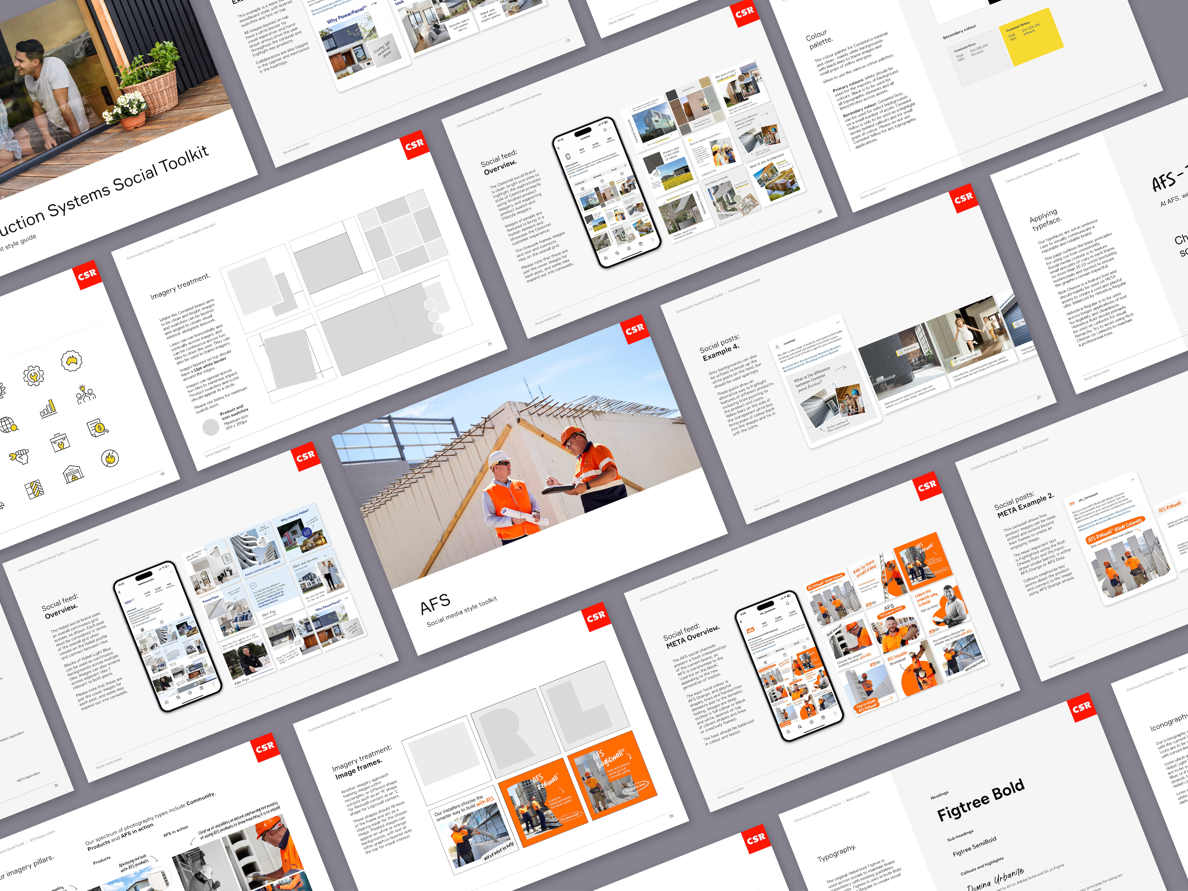


CSR SOCIAL MEDIA REFRESH
As a leader in the Australian construction industry, CSR wanted to open up their online audiences and attract a wider range of consumers for three of their most prominent brands: Hebel, Cemintel and AFS Permanent Formwork. Existing brand colours and imagery were used to develop a new set of guidelines, specifically for social media content.
These guidelines were then used to design social media posts in alignment with a monthly content plan, highlighting key features, products and services of each brand. New fonts and stylistic choices were made to elevate CSR’s social presence and gain consumer trust through consistent brand language.
These guidelines were then used to design social media posts in alignment with a monthly content plan, highlighting key features, products and services of each brand. New fonts and stylistic choices were made to elevate CSR’s social presence and gain consumer trust through consistent brand language.
︎ Social media
︎ Brand guidelines
Developed in collaboration with Lujia Zhou at Focus Group.
︎ Iconography
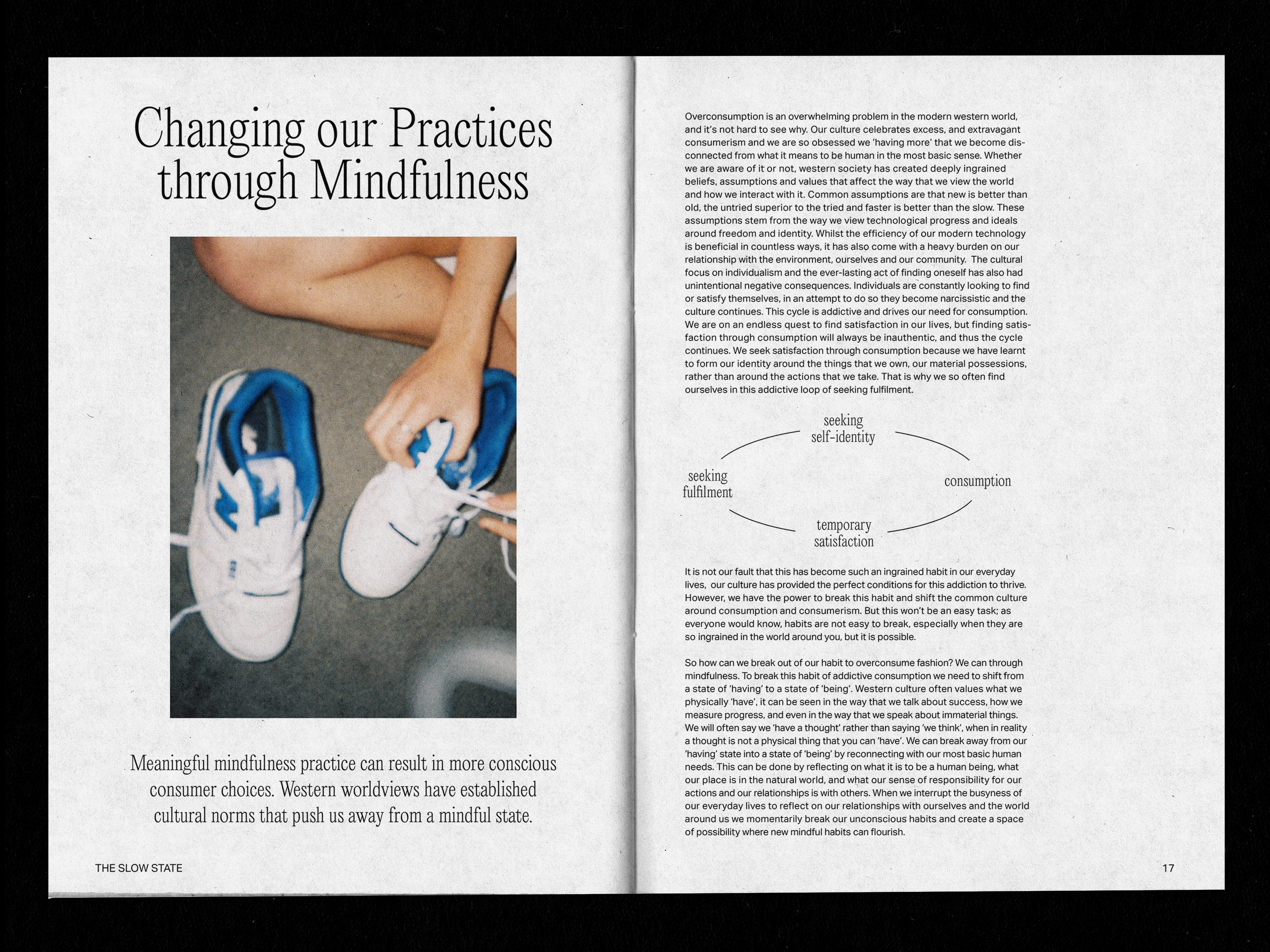

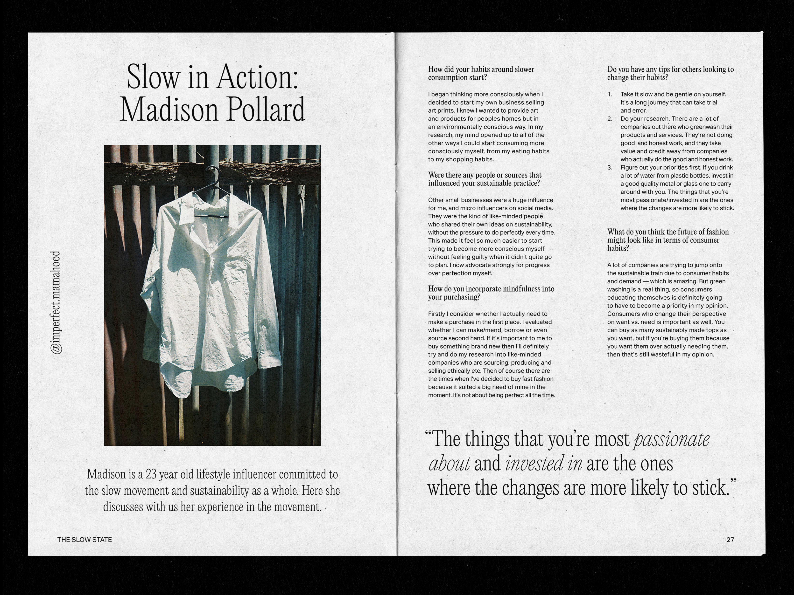


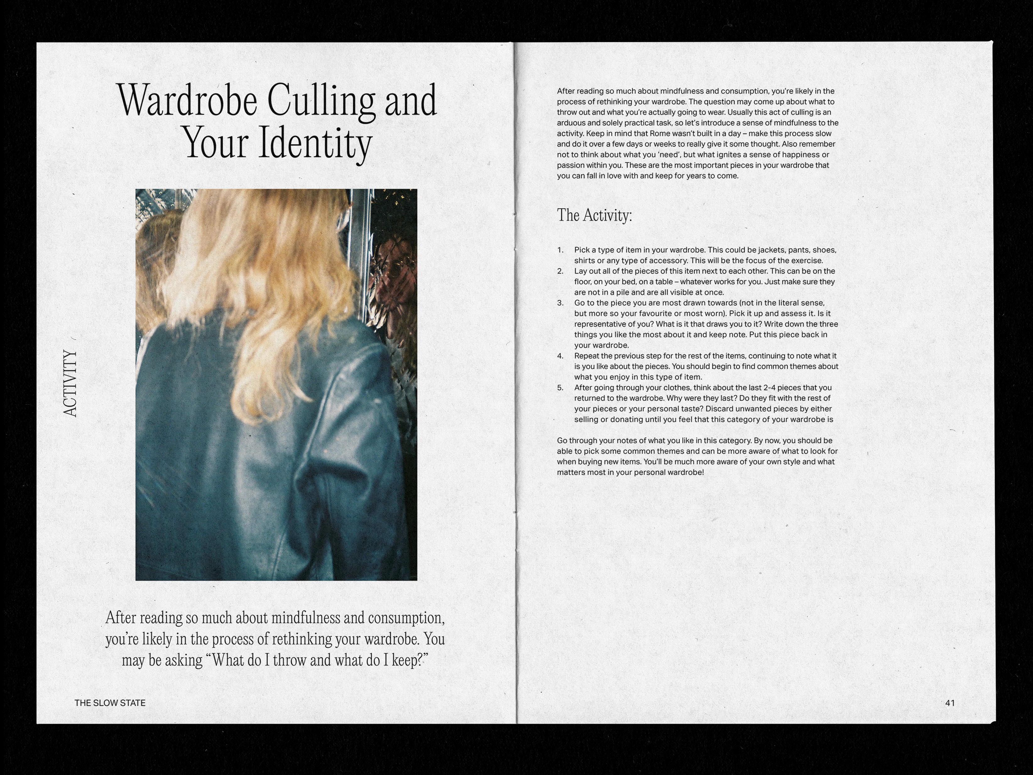


THE SLOW STATE
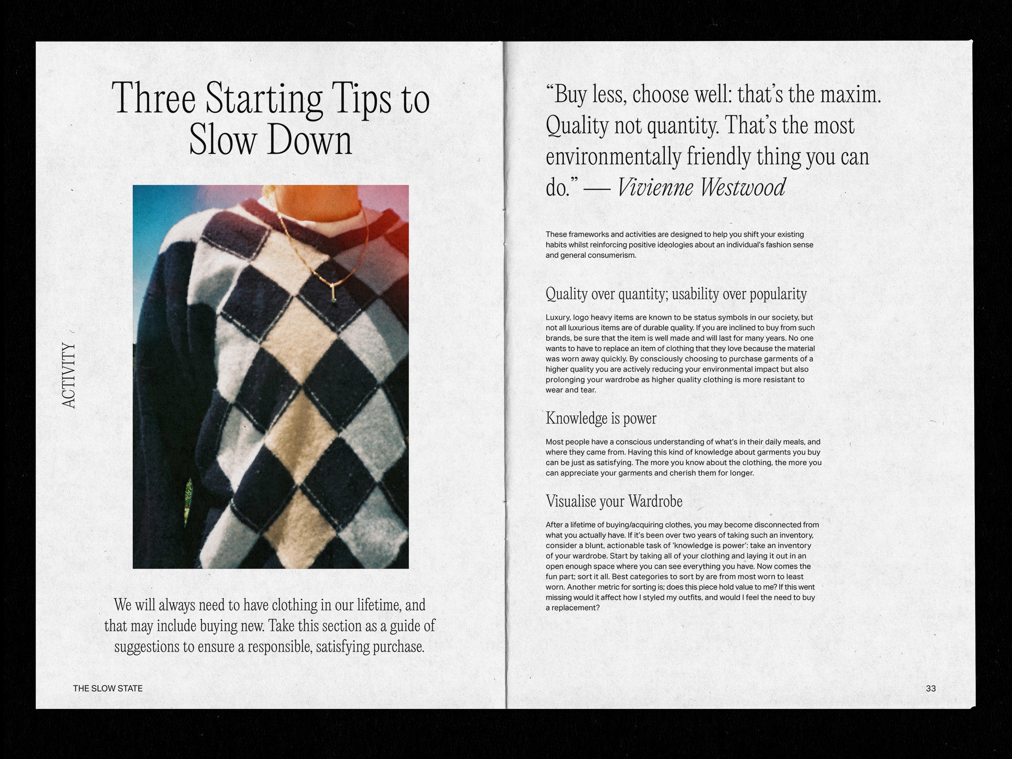
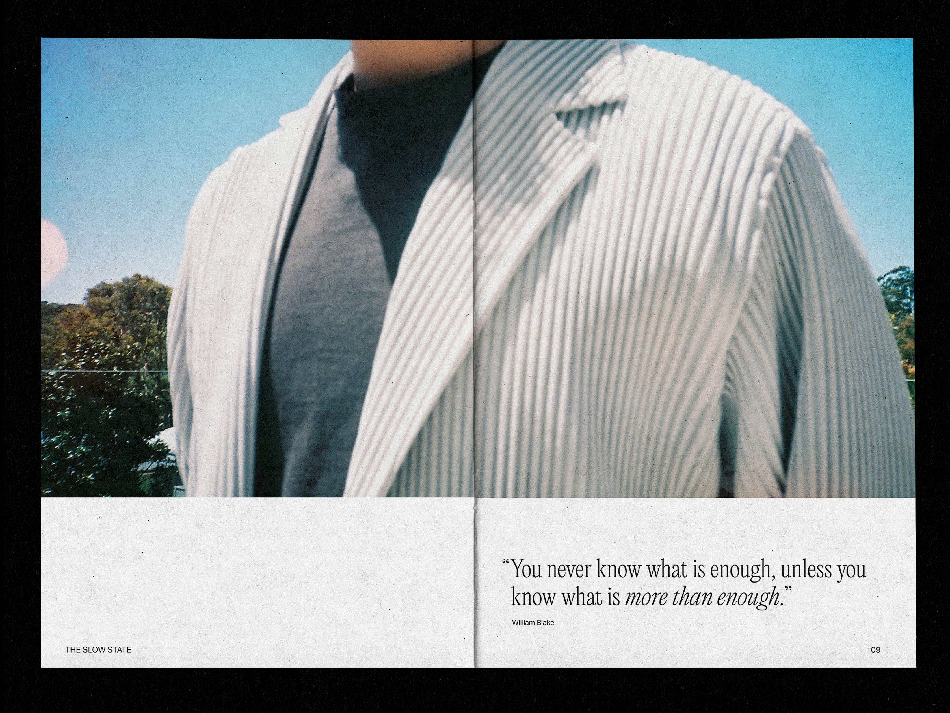
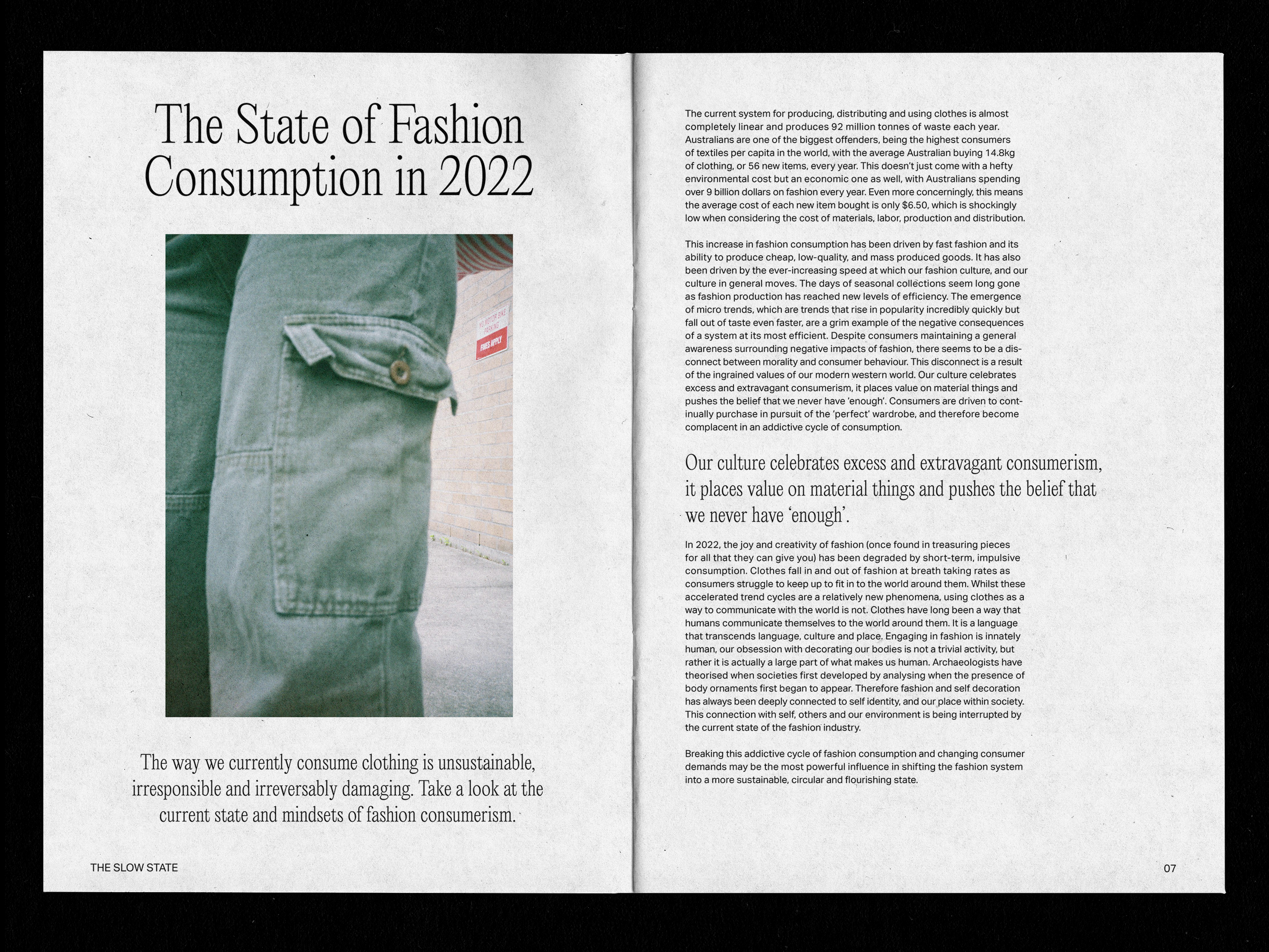
Created as a final collaborative capstone project for the Bachelor of Creative Intelligence + Innovation, Slow State is an exploration of the connection between mindfulness and fashion consumption, built from months of stakeholder engagement, research, testing and prototyping and our own human experiences. This was both a research task and a design challenge, encapsulated in its final form as a print zine.
The zine encourages slow reading and reflection as it is scattered with film images taken by me, quotes and short activities. It bridges knowledge barriers by providing information on the current state of the fashion industry, how unsustainable habits are formed and how they can be broken. This zine was presented to the cohort alongside a mindfulness workshop, allowing audiences to experience and engage with key exercises developed through our research.
The zine encourages slow reading and reflection as it is scattered with film images taken by me, quotes and short activities. It bridges knowledge barriers by providing information on the current state of the fashion industry, how unsustainable habits are formed and how they can be broken. This zine was presented to the cohort alongside a mindfulness workshop, allowing audiences to experience and engage with key exercises developed through our research.
︎ Print design
︎ Research and evaluation
︎ Workshop development
︎ Photography
Developed in collaboration with Alan Kinal, Gillian Le Mottee, Jackson Roca, Eloise Trainor and Anousha Xegas.


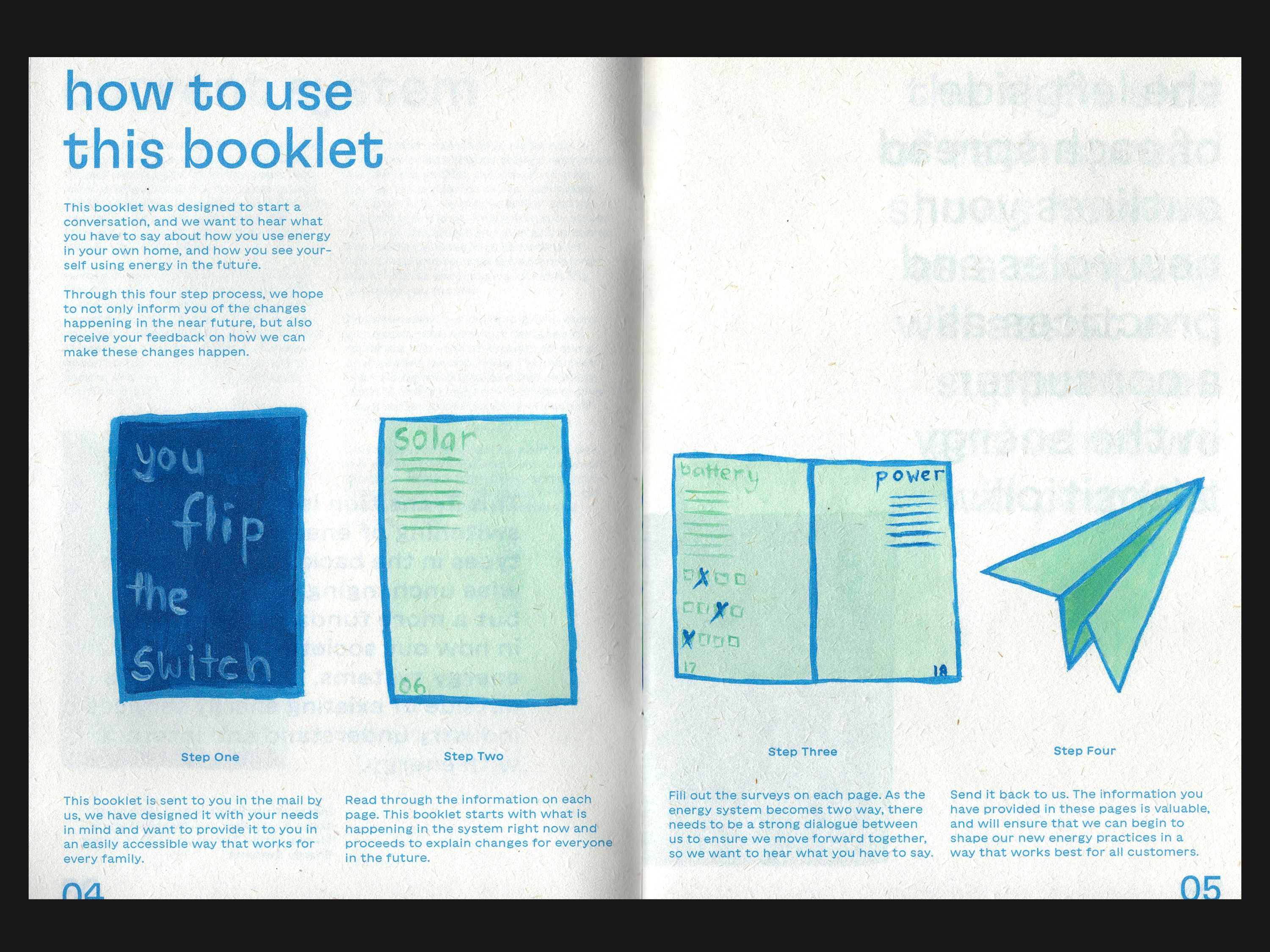


YOU FLIP THE SWITCH
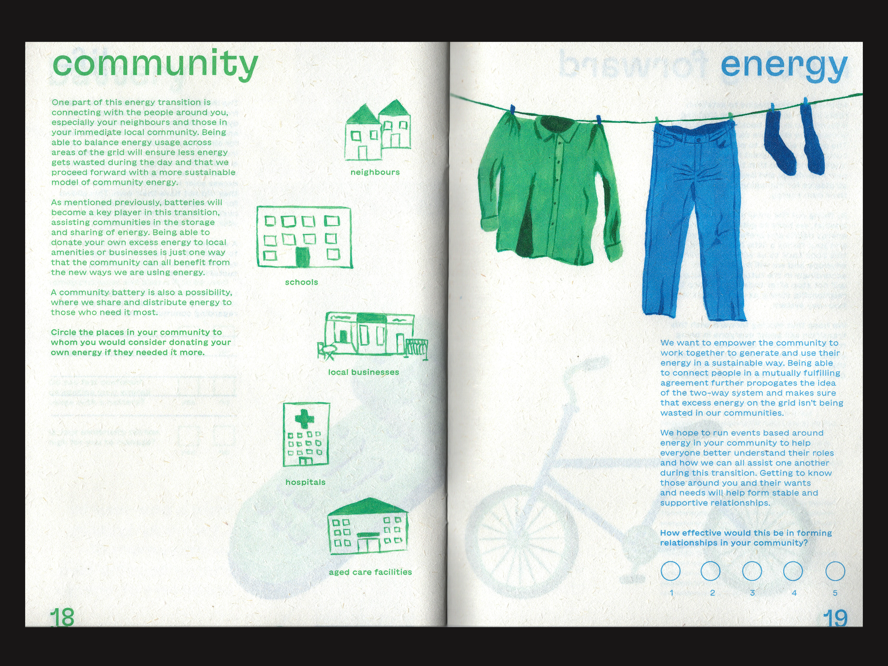
Australia is moving towards a new way of using more renewable energy, and this shift is one of the biggest changes in history. There is a large gap in the market for the visual communication of this change to the public, and this brief sought to generate new ways of thinking about the energy transition.
Embracing the concept of a ‘two-way system’, where customers become producers and energy is everyone’s responsibility, this publication addresses new roles and practices of both consumers and energy companies. Utilising duality in colour scheme and a mirrored layout to emphasise the two-way system, this publication explores the roles of the consumers on the left pages and the energy companies on the right. All illustrations were hand-painted with acrylic, and the publication was printed onto recycled paper and staple bound.
︎ AGDA 2021 Student Publication MERIT
︎ AGDA 2021 Student Print MERIT
︎ Illustration
︎ Publication design
︎ Research and development
︎ Copywriting
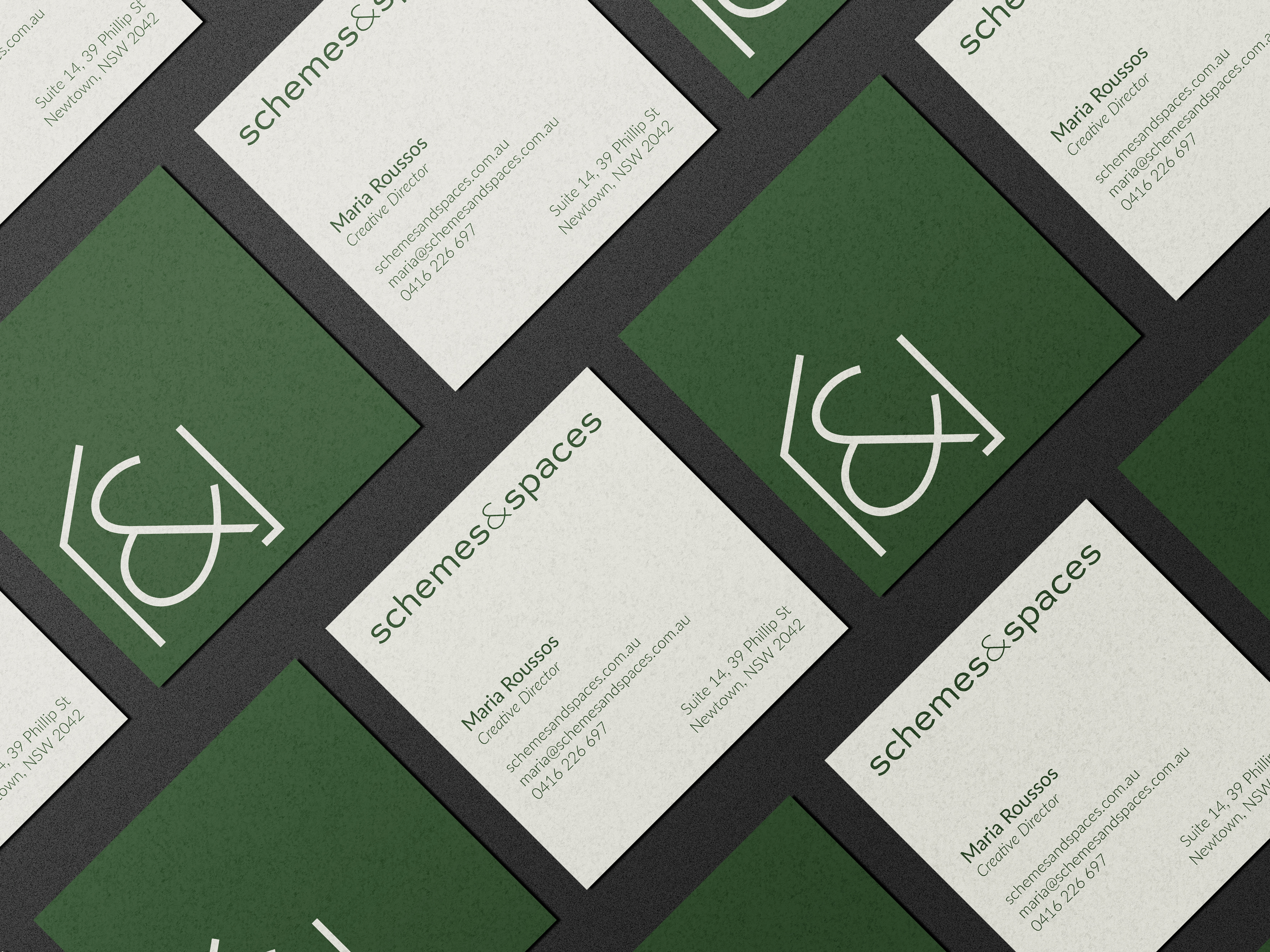
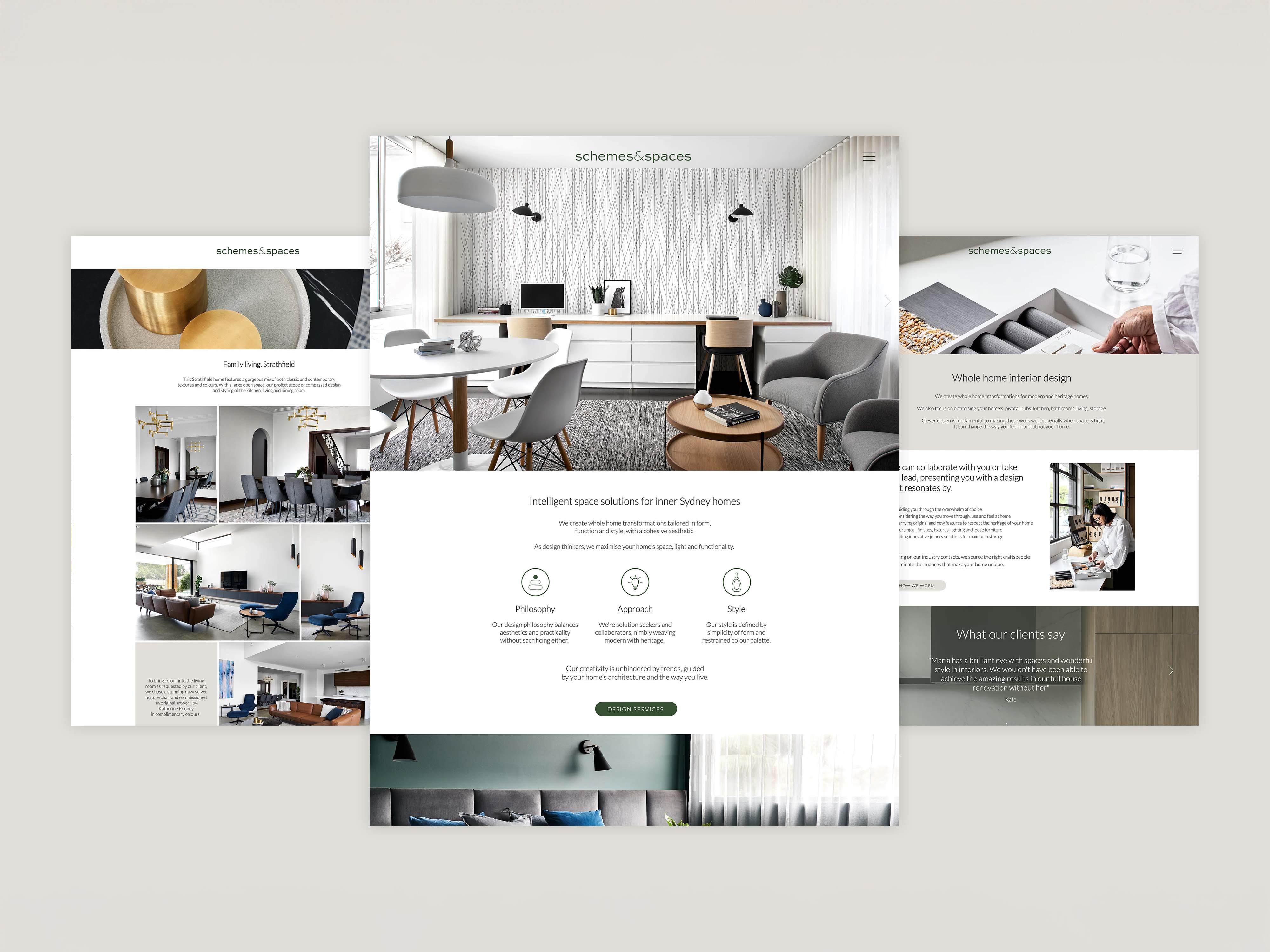


SCHEMES & SPACES
Schemes & Spaces is an interior design company based in the Inner West. For this re-brand, Director Maria Roussos wanted the branding to mirror her style - clean, polished and sophisticated with a modern edge. Working across branding, web and print, this redesign featured thin lines and a visual motif alluding to the shape of a house.
︎ Branding and logo design
︎ Web design

I am a strategic and visual designer with a strong focus on collaboration, in-depth research, and creating meaningful, impactful change. My experience spans diverse industries, including education, sustainability, marketing, government, and the not-for-profit sector. I specialise in seamlessly integrating human-centred design thinking and research with business strategy in order to create effective visual solutions.
I received a Bachelor of Visual Communication and a Bachelor of Creative Intelligence and Innovation from UTS. My background in graphic and strategic design has honed my ability to visualise complexity and design elegant solutions — always being driven by the underlying "why"— investigating problems, systems, and relationships beyond surface-level insights.
I acknowledge that I am living and designing on the land of the Gadigal people, Eora nation. Sovereignty was never ceded, and I pay respects to elders past, present and emerging.
︎︎︎ Email me